![]()
![]()
![]()
![]()
![]()
![]()
Re: Equivalent functionality to colorbar in Mathematica?
- To: mathgroup at smc.vnet.net
- Subject: [mg81773] Re: Equivalent functionality to colorbar in Mathematica?
- From: "David Park" <djmpark at comcast.net>
- Date: Wed, 3 Oct 2007 02:32:28 -0400 (EDT)
- References: <200709300744.DAA20164@smc.vnet.net> <fdt3a6$roe$1@smc.vnet.net>
Mike,
data = Table[Exp[-(x^2 + y^2)], {x, -3, 3, 0.1}, {y, -3, 3, 0.1}];
Row[{ListPlot3D[data,
PlotRange -> All,
Boxed -> False, Axes -> False,
ColorFunction -> "TemperatureMap",
Mesh -> False,
ImageSize -> 350],
ContourPlot[y, {x, 0, .1}, {y, 0, 1},
ColorFunction -> "TemperatureMap",
AspectRatio -> Automatic,
PlotRange -> {{0, 0.1}, {0, 1}},
PlotRangePadding -> 0,
FrameTicks -> {{Automatic, None}, {None, None}},
ImageSize -> 35]}, Spacer[5]]
--
David Park
djmpark at comcast.net
http://home.comcast.net/~djmpark/
"Mike Croucher" <michael.p.croucher at googlemail.com> wrote in message
news:fdt3a6$roe$1 at smc.vnet.net...
> Hi all
>
> The following two commands produce a nice looking plot (in my opinion
> anyway)
>
> data=Table[Exp[-(x^2+y^2)],{x,-3,3,0.1},{y,-3,3,0.1}];
> ListPlot3D[data,PlotRange->All,Boxed->False,Axes->False,ColorFunction->"TemperatureMap",Mesh->False]
>
> The colour of the plot is related to the value of the data via the
> TemperatureMap colour function but how do I include this information in a
> legend on the plot? Ideally I would like to create something similar to
> the
> legends shown in the following links
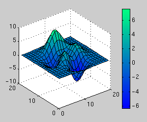
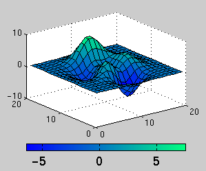
>
> http://www.walkingrandomly.com/images/random/colorbar.gif
> http://www.walkingrandomly.com/images/random/colorbar2.gif
>
> Does anyone know of a simple way of doing this in Mathematica?
>
> Thanks in advance,
> Mike
>
>